Total Synergy — brand

Using the Total Synergy brand assets

These guidelines explain the key visual elements of the Total Synergy brand, so that we can bring it to life across all internal and external communications. Clear and consistent use of these elements will ensure the brand is represented correctly both digitally and in real-life.

The Total Synergy brand marks — logos, are the primary elements of our identity. However, there are many more components that create our visual style. These include:

The corporate logo  |   The product logo  |  Colours  |  Typography  |  Photography |  Icons

Total Synergy
Corporate logo

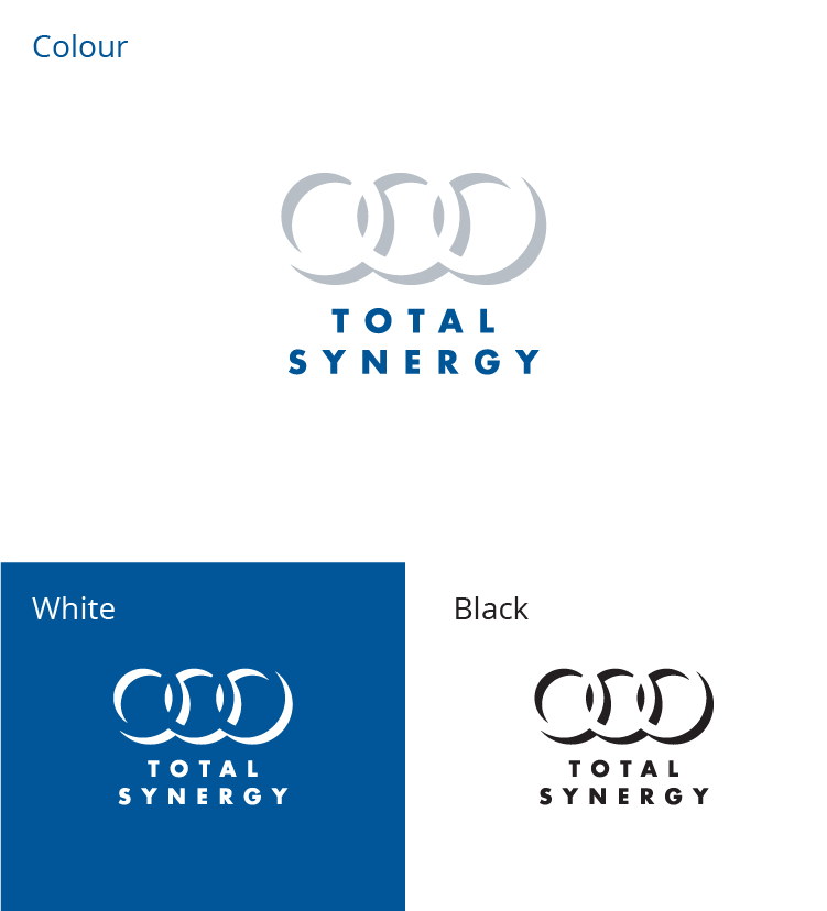
The Total Synergy corporate logo represents the company and our legacy.

The Total Synergy logo should be used in all communications from and about the company in general.

It’s available in 3 colour ways for use in varying situations. Primarily you should use the colour version where possible. White over dark backgrounds and images and black as a last resort.

Synergy
Product logo

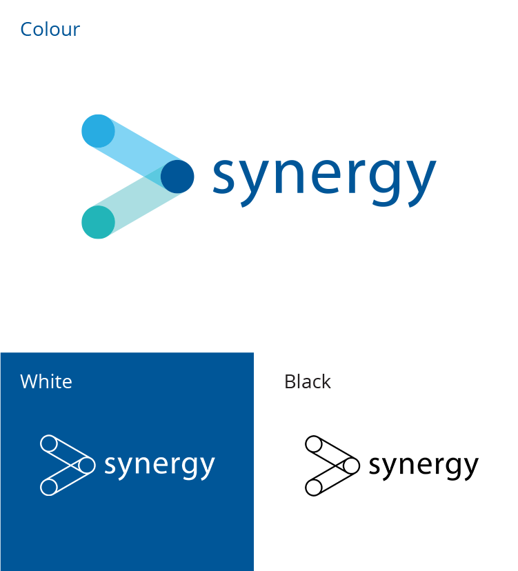
The Synergy product logo represents the cloud based software we sell.

The Synergy logo should be used in all communications that are product specific. The Total Synergy logo should also be included in these communications but as a secondary logo with the preceding text “A Total Synergy Product”. The text and logo should appear in a single corporate colour.

It’s available in 3 colour ways for use in varying situations. Primarily you should use the colour version where possible. White over dark backgrounds and images and black as a last resort.

Total Synergy
Logo usage

Let the brand mark breathe.

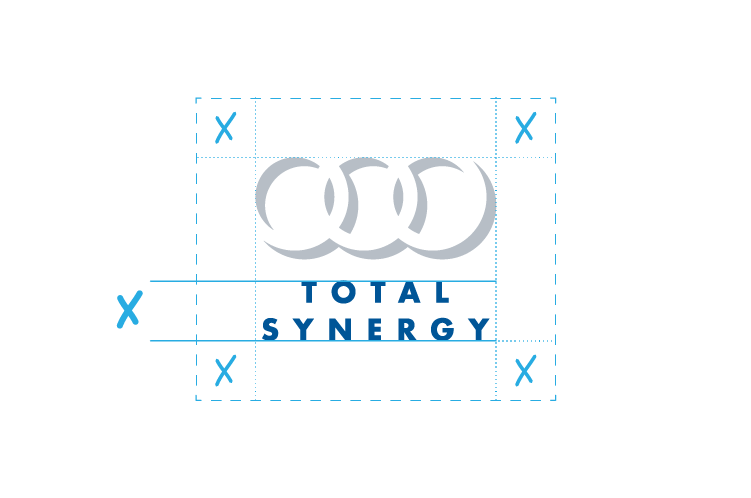
To aid in its clarity, the brand mark should be given adequate clear space around them. Use a minimum clear space around the brand mark equal to the height of the Total Synergy text as shown.

Use high contrast.

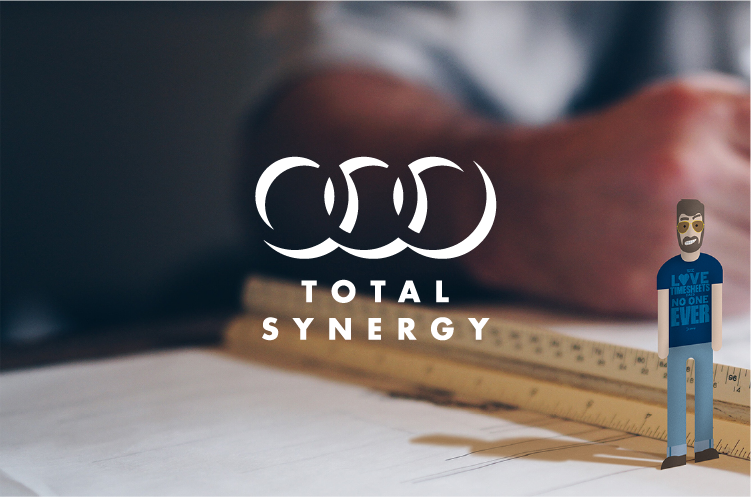
When using the brand mark on coloured backgrounds or photography make sure that there is enough contrast to aid visibility. If using on a dark background, use the white brand mark.

Don’t over complicate.

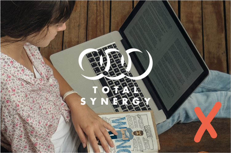
When using the brand marks on photography they should always be placed in areas with minimal detail. Preferably in blurred or clear areas to aid in their visual clarity.

Do not distort the brand mark.

The brand mark should never be stretched, pulled, twisted, pulled apart, used with just the rings or just the text or re-coloured. Keep the brand mark straight and in proportion as provided.

Total Synergy
Colours

0
85
152

#005598

98
73
11
1

R 40
172
226

#28ace2

70
14
0
0

R 5
155
158

#059b9e

81
19
Y 40
1

R 51
51
51

#333333

69
63
Y 62
58

Total Synergy
Typography

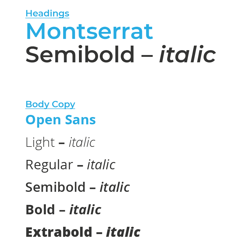
The typeface we use for headings is Montserrat Semi-bold. This is a free google font which can be used online and on your computer. It is available for download here.

The typeface we primarily use for Total Synergy is Open Sans. We use this for body copy for both screen and print. This is a free google font which can be used online and on your computer. It’s available for download here.

When Open Sans is not available then Verdana can be used. This typeface is available for free with Microsoft products. This is to be used on email signatures and other communications where you may not have access to Open Sans.

Total Synergy
Photography

Total Synergy has a distinct photography style that is casual, fun and aspirational. It reflects how architects, engineers and construction designers (AEC) aspire to work and/or spend their time (aka more time for design). It tells an optimistic story about a stress-free lifestyle rather than overtly selling software. It should make you smile and want to be that person or work in a place like that.  

Photography is a big part of the Total Synergy’s brand as it demonstrates a personal side of the business that not only creates a connection with customers, but differentiates us from the competition. It supports Synergy’s human voice – authentic, honest, personal and humerous – and our values – respect, integrity and care (#RIC). 

Mood 

Happy, playful, energetic and stress-free – sometimes a bit quirky (geeky and/or funny) 

People 

Most photography in the AEC market features stunning buildings or shiny building products, not people. The same is true for most software companies ie software is featured, not people. Total Synergy uses people in photography to stand out in the market and make the AEC and technology industriesand indeed our company – more human.  

Relatable people (not pixel-perfect models) should feature as the hero in the foreground of photography. People should look natural, happy and positive. They should be dressed informally, yet smart and current – a bit edgy but not over the top. Use a mix of gender and race suitable for a global AEC market. Optimal age is mid 30s but can range from 21 to 50.  

People should be engaged and enjoying work or a real-life hobby/activity like riding, playing, dining, travelling, singing, painting, watching jumping, swimming, singing, dancing and so on. Nothing to risqué or obscure. They can be alone or with others.  

People should be looking off camera or giving direct eye contact. Faces and eyes often capture emotion and personality the best, so limit photography that hides or crops them. It’s important to create a sense of naturalness and avoid cliched poses or actions. Candid shots often work well. 
Location 

Location can be anywhere that is light and bright – inside, outside, at office, at home or onsite. Use non-traditional locations to help promote Total Synergy culture and personalityinstead of just people standing underneath signage at the office. 

Always consider the target market and season at time of placement. 

Wingman – feeling a connection 

Wingman was illustrated in 2015 to help bring the Total Synergy brand to life. He is incorporated into photography website, social and advertising – to help communicate our personality and uniqueness to our customers. Being a wingman, he is rarely the hero of photography rather working in the background or giving someone a helping hand. 

Product images 

Product screenshots are rarely used in Total Synergy photography because they are too bland and/or detailed to create a connection with customers. People with mobile devices are used instead to amplify our cloud, mobile and collaboration messages. Sometimes minimal and stylised product illustrations are used to highlight specific features or hint that people are using our products. This also gives the images a longer shelf-life as you don’t have recreate the image every time the product is updated. 

Stock photography 

Original photography is preferred to stock photography, but stock is used when time and budgets are tight. It is important that stock images are carefully sourced and purchased with the appropriate royalty free licenses. Cliched and over-used stock is avoided. Stock photography is often blended with professional illustrations (like wingman) to make it uniquely ours. 

Your own photography 

In this digital age, many of us constantly take photos (usually on our phones or occasional someone brings a fancy SLR camera). If you capture a great Total Synergy moment and think it’s appropriate to share (internally and/or externally) please let marketing know. They can often use your photography on our social media channels – with your permission (of course).  

Online images and copyright 

Before you copy an image found online into a Total Synergy document, assume it is protected by copyright. When possible, use photography we’ve taken; purchased; have permission to use; or have a Creative Commons (CC) license. 

See content guidelines for more information http://brand.totalsynergy.com/index.php/documentation/copyright-and-trademarks/ 

Total Synergy
Icons

We have a number of icons to visually represent the different features of the Synergy product. These must be used in conjunction with the name of the feature to ensure that the feature is clearly defined.

Each icon consists of a white outline which forms the icon. The icon then sits on either a teal, dark blue or light blue circle.